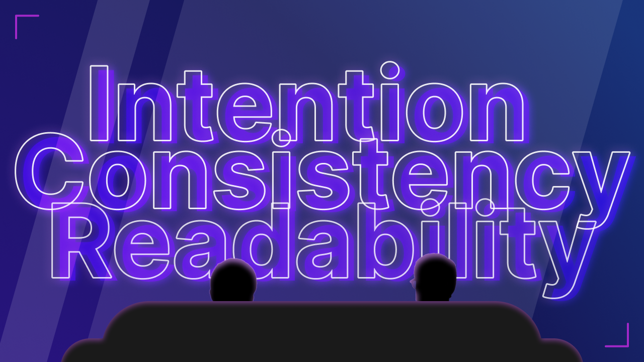

HBO Max app recently updated the app icon and interface. Performance issues aside, here are three areas I’d like to improve for the app:
Intention in the experience
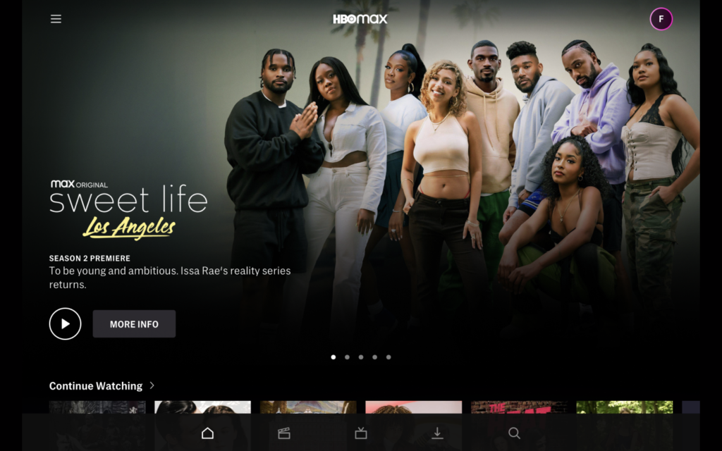
“It’s still not clear to me what HBO Max wants me to do.”
In terms of experience design, it may help the HBO Max app to clarify its “intentions” from the very beginning.
While featuring new releases prominently above the fold, maybe consider offering more reasons why the new releases are worth a viewer’s time. Those reasons can be tied with genres and/or subject matters, providing more context for the content. Such context helps to better communicate the “value” of the content to a viewer by removing doubts and guesswork.
As an interface design detail, “Play” and “More info” button can benefit from a clearer visual hierarchy. To encourage users to click “Play” button, maybe give the “Play” button more visual weight with a solid fill. Or maybe include a text label for the “Play” button and use an icon for “More info” instead, so that one button stands out more than the other.
Hierarchy and Consistency in wayfinding
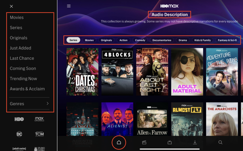
“I got lost in the app. A few times. Until I realized that the tabs were overlapping with the ‘hamburger’ menu items.”
A clear functional hierarchy among the different components of the wayfinding system helps to avoid confusion.
Use primary navigation to house top-level categorical information. For the HBO Max app, that can be the different types of content or functions users want to get to quickly, e.g. New Releases, Movies, TV Shows, Search, Account Settings etc.
Secondary navigation can be nested within the primary navigation. Within Movies, for example, different genres can be used as secondary navigation. For a large body of content, it also helps users explore with additional filters and sorting options.
Additional, for major app updates, I’d also consider revisiting journey mapping, with both problem and solution space research. Especially for apps that cater to a wide range of users, involving existing users and potential users can help get more insights and uncover potential wayfinding issues.
Readability in typography
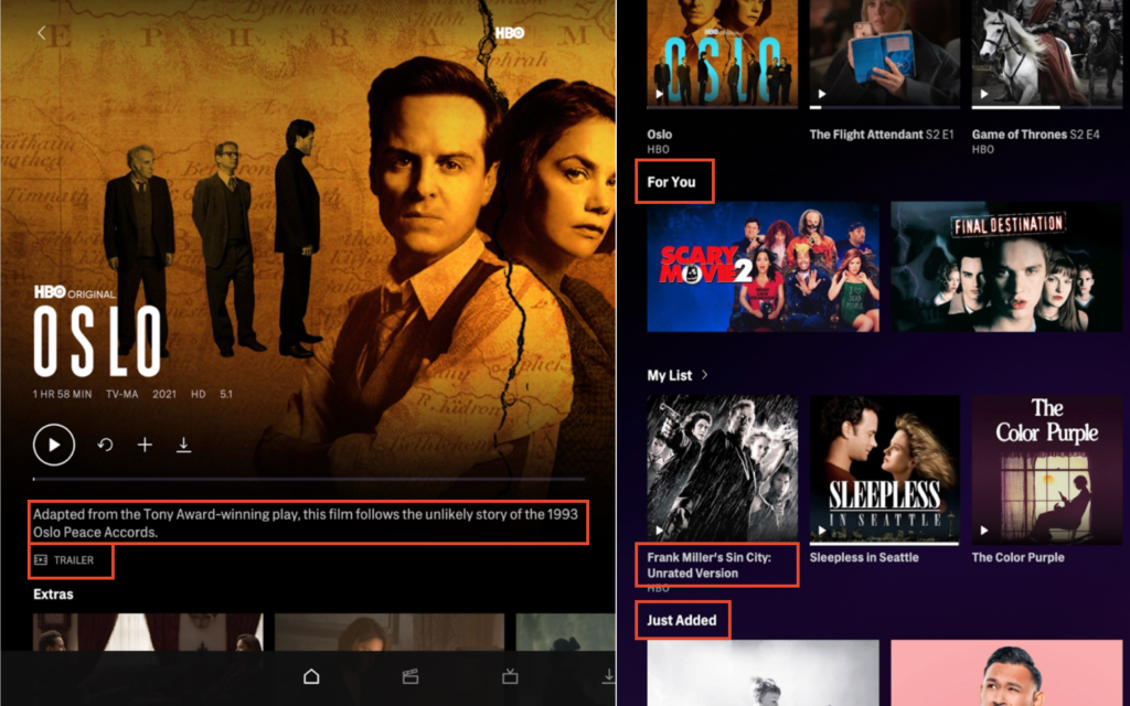
Even though the HBO Max app is largely driven by visual content, it can still benefit from improving text readability with a clearer type system.
Considering how we generally scan a page, making text “scannable” is a good starting point. Assigning more visual weight to headers is an easy way to help them stand out. Headers such as “For you” or “Popular Movies” are conceptually significant since they provide context for the following content. When a user is simply exploring, scannable headings help them quickly get to content of their interest.
Type sizes should also be adjusted for different devices for readability. Text on a phone or a tablet may need to be scaled up to be readable on a TV screen in a living room – Viewing content on an iPad from 1.5ft away is comparable to viewing content on a 55-in TV from 7.8ft away – That means if text appears a bit small on the iPad when you hold it in your hands, chances are that the text would appear too small on the bigger screen.
__________
HBO stands out with its epic content, and I definitely would welcome an epic interactive experience that it deserves.